Creating a New Chart v8
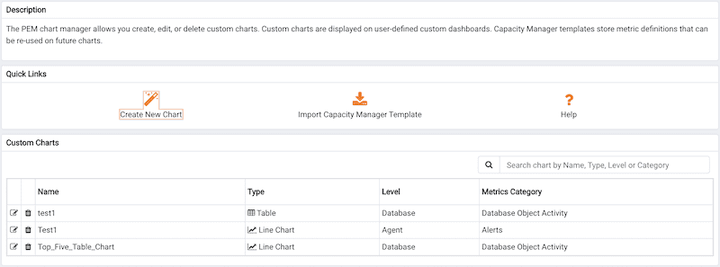
Click the Create New Chart icon in the Quick Links section of the Manage Charts tab to open the Create Chart wizard. The Create Chart wizard will walk you through the steps required to define a new chart.
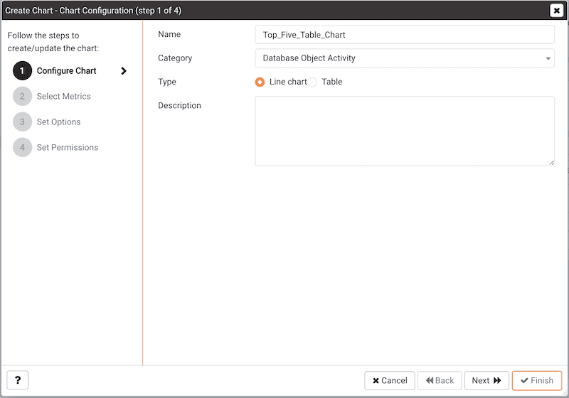
Use the fields on the Configure Chart dialog to specify general information about the chart:
- Specify the name of the chart in the
Namefield. - Use the drop-down listbox in the
Categoryfield to specify the category in which this chart will be displayed; when adding a custom chart to a custom dashboard, the chart will be displayed for selection in theCategoryspecified. - Use the radio buttons in the
Typefield to specify if the chart will be aLine chartor aTable. - Provide a description of the chart in the
Descriptionfield. The description will be displayed to the user viewing the chart (on a custom dashboard) when they click the information icon.
When you've completed the fields on the Configure Chart dialog, click Next to continue.
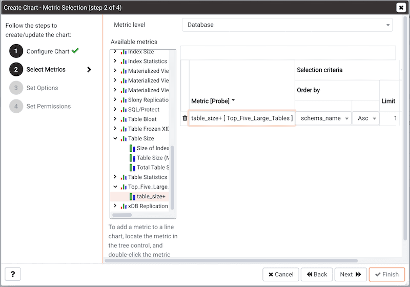
Use the fields on the Select Metrics dialog to select the metrics that will be displayed on the chart:
Use the
Metric leveldrop-down listbox to specify the level of the PEM hierarchy from which you wish to select metrics. You can specifyAgent,Database, orServer. Each level offers access to a unique set of probes and metrics.Use the tree control in the
Available metricsbox to select the metrics that will be displayed on the chart.- If you are creating a table, you may only select metrics from one probe; each node of the tree control lists the metrics returned by a single probe. Expand a node of the tree control, and check the boxes to the left of a metric name to include that metric data in the table.
- If you are creating a line chart, expand the nodes of the tree control and double-click each metric that you would like to include in the chart.
Use the fields in the
Selected metricspanel to specify how the metric data will be displayed in your chart. The selection panel displays the name of the metric in the (non-modifiable)Metric [Probe]column. You can:Click the garbage can icon to delete a metric from the list of selected metrics.
Use the drop-down listboxes in the
Selection Criteriacolumn to specify the order of the data displayed.Use the
Limitfield to specify the number of rows in a table or lines in a chart:The maximum number of lines allowed in a chart is 32.
The maximum number of rows allowed in a table is 100.
If you are creating a line chart, PEM supports comparisons of cross-hierarchy metrics.
- Click the compare icon to open a selection box that allows you to select one or more probe-specific attributes (i.e. CPUs, interfaces, databases, etc.) to compare in the chart.
- Click the copy icon to apply your selections to all of the metrics for the same probe. When the popup opens, click
Yesto confirm that other selections for the same probe will be overwritten, orNoto exit the popup without copying the attributes.
When you've completed the fields on the Select Metrics dialog, click Next to continue.
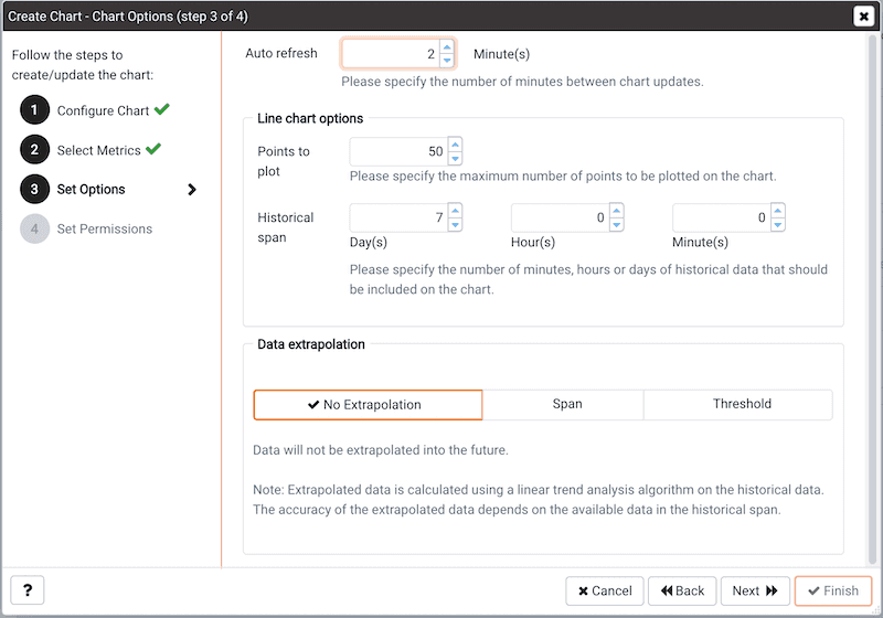
Use the fields on the Set Options dialog to specify display options for your chart:
- Use the
Auto Refreshfield to specify the number of minutes between chart updates - choose a value from 1 to 120. The default auto refresh rate is 2 minutes.
Use fields under the Line chart options heading to specify display preferences for a line chart:
- Use the
Points to plotfield to specify the maximum number of points that will be plotted on the chart. - Use the fields to the right of the
Historical spanlabel to specify how much historical data should be displayed on the chart:- Use the
Day(s)field to specify the number of days of historical data that should be included on the chart. - Use the
Hour(s)field to specify the number of hours of historical data that should be included on the chart. - Use the
Minute(s)field to specify the number of minutes of historical data that should be included on the chart.
- Use the
- Use the fields in the
Data extrapolationbox to specify if PEM should generate extrapolated data based on historical data.- Click the
No Extrapolationlabel to omit extrapolated data from the chart. - Click the
Spanlabel to use theDaysandHoursselectors to specify the period of time spanned by the metrics on the chart. - Click the
Thresholdlabel to use threshold selectors to specify a maximum or minimum value for the chart.
- Click the
When you've completed the fields on the Set Options dialog, click Next to continue.
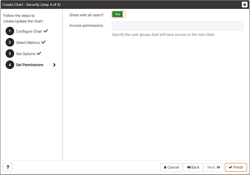
Use the fields on the Set Permissions dialog to specify display options for your chart:
- Set the
Share with allslider toYesto indicate that the chart will be available to all authorized users, orNoto restrict access to the users or groups specified in theAccess permissionsfield. - Use the
Access permissionsfield to select the group or groups that will have access to the chart.
When you've finished defining the chart, click Finish to save your edits and add your chart to the list on the Manage Charts tab:
