Performance Diagnostic v8
The Performance Diagnostic dashboard analyzes the database performance for Postgres instances by monitoring the wait events. To display the diagnostic graphs, PEM uses the data collected by the EDB Wait States module.
Note
For PostgreSQL databases, Performance Diagnostic is supported for version 10 or later installed on the supported RHEL platforms.
For EDB Postgres Extended databases, Performance Diagnostic is supported for version 11 or later on the supported RHEL platforms.
For more information on EDB wait states, see EDB wait states.
To analyze the Wait States data on multiple levels, narrow down the data you select. The data you select at the higher level of the graph populates the lower level.
Prerequisites
For PostgreSQL, you need to install the
edb_wait_states_<X>package fromedb.repo, where<X>is the version of PostgreSQL Server. For the steps to install this package, see EDB Build Repository. For EDB Postgres Advanced Server, you need to install theedb-as<X>-server-edb-modules, where<X>is the version of EDB Postgres Advanced Server.After you install the EDB Wait States module of EDB Postgres Advanced Server:
Configure the list of libraries in the
postgresql.conffile as shown:shared_preload_libraries = '$libdir/edb_wait_states'
Restart the database server.
Create the following extension in the maintenance database:
CREATE EXTENSION edb_wait_states;
You need superuser privileges to access the Performance Diagnostic dashboard.
If the prerequisites aren't met, then an error appears when you access the Performance Diagnostic dashboard:
Using the Performance Diagnostic dashboard
To open the Performance Diagnostic dashboard, on the PEM client select Tools > Server > Performance Diagnostic.

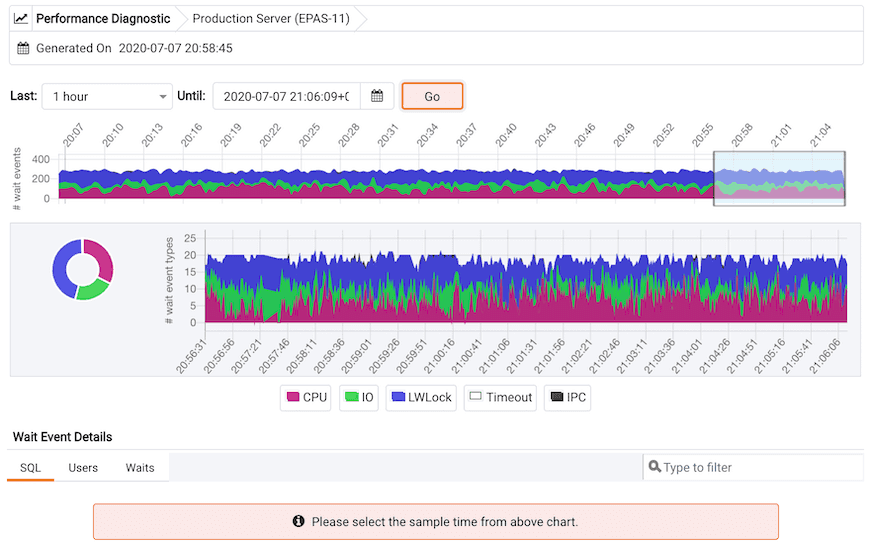
By default, the top Performance Diagnostic graph pulls the data of the last hour, starting from the current date and time. This graph shows the time series containing the number of active sessions. Each point of this time series represents the active sessions along with the wait events at a particular time and in the last 15 seconds. These sessions might be waiting for a wait event or using the CPU at a particular point in time. This time series is generated based on the wait event samples collected by the EDB Wait States extension.
To open the Performance Diagnostic dashboard in a new browser tab, select Preferences > Open in New Browser Tab?.
The duration selection in the first graph is 10 minutes. To see the duration on a graph, select a duration from the Last list. To display the data for a specified date and time, select a date and time from the Until list.
The first graph displays the number of active sessions and wait event types for the selected duration. You can change the duration in the first graph to analyze the data for a specific time period.
The next section plots the following graphs based on the selected duration in the first graph:
Donut graph — Shows total wait event types according to the duration selection in the first graph. It can provide a better understanding of how much time was spent by those sessions on waiting for an event.
Line graph — Plots a time series with each point representing the active sessions for each sample time.
To differentiate each wait event type and the CPU usage more clearly, the graph for each wait event type displays in a different color.
Select a time on the Line graph to analyze the wait events. The third section displays the wait event details in the Performance Diagnostics dashboard based on your selected duration in the second graph. The third section displays wait event details on three tabs:
- The SQL tab displays the list of SQL queries having wait events for the selected sample time.
- The Users tab displays the details of the wait events grouped by users for the selected sample time.
- The Waits tab displays the number of wait events belonging to each wait event type for the selected sample time.
To show or hide a wait event type in all the graphs, select the graph legends. The analysis is simpler when you can only see the wait event types you want to analyze.
You can filter the data displayed in the rows under all three tabs. You can also sort the data alphabetically by selecting the column headers.
Select the eye in any row of the SQL tab to display a window with details on the query of that row. This window displays a query ID and its corresponding session IDs in a list at that selected sample time in the Query information section. You can select the Session ID list for the selected query that you want to analyze the data. The details corresponding to the selected session ID and query ID appear. The Query information table also displays the SQL query.
The Wait event types section displays the total number of wait event types for the selected session ID and query ID. It shows two types of graphs:
Donut graph — Shows the proportions of categorical data.
Timeline bar graph — Visualizes trends in counts of wait event types over time.
To differentiate, each wait event type is represented by a different color in the bar graph.

The Wait events section has a table displaying all the wait events that occurred during the query execution. It displays data in decreasing order by number of wait events. The second table displays the wait event with sample times that occurred over the period of the whole query execution. It allows you to analyze the wait events during the query execution over the period of time. Also, it shows the actual samples collected by the EDB Wait States extension for that query ID and session ID.