Regression Analysis in PostgreSQL with Tensorflow: Part 2 - Data Pre-processing
In part 1 of this blog mini-series on machine learning, we looked at how to setup PostgreSQL so that we can perform regression analysis on our data using TensorFlow from within the database server using the pl/python3 procedural language. We also looked at some of the basics of pl/python3 as a primer for what is to come in this and part 3 of the series.
In this part, we'll look into data pre-processing. In order to ensure that our regression analysis is as accurate as possible, we first need to analyse and understand the raw data. We can use what we learn to remove outlier values from the training and validation datasets to ensure those values don't skew the results. In addition, we need to look at the columns in the data to understand which are strongly correlated and which are loosely or even uncorrelated with the result. These columns (or features in machine learning parlance) can be removed from the training and validation data to simplify the work of the neural network and increase its accuracy.
The experimental code discussed in this post can be found on Github; we'll be focussing on the tf_analyse() function. The examples shown are based on analysis of the Boston Housing Dataset.
Opening boilerplate
The tf_analyse() function begins with what we might think of as the boilerplate code; it's required, but not particularly interesting:
CREATE OR REPLACE FUNCTION public.tf_analyse(
  data_source_sql text,
  output_name text,
  output_path text)
   RETURNS void
   LANGUAGE 'plpython3u'
   COST 100
   VOLATILE PARALLEL UNSAFE
AS $BODY$
import pandas as pd
import matplotlib.pyplot as plt
import seaborn as sns
from math import ceil

# Pandas print options
pd.set_option('display.max_rows', None)
pd.set_option('display.max_columns', None)
pd.set_option('display.width', 1000)
The first section is the SQL code used to declare that we're defining a pl/python3 function. It will take three text parameters when called:
- data_source_sql: The SQL to execute to get the data to be analysed.
- output_name: A name for the analysis, to be used in filenames etc.
- output_path: The directory in which to store the files we save. Note that the user account under which PostgreSQL is running must be able to write files to this directory.
The function doesn't return anything, so is marked with a return type of void. I've set an arbitrary cost, and marked it as volatile (meaning it may have different output each time it's run, even when called with the same parameters), and marked it as unsafe for parallel execution.
The function will be called like this:
SELECT tf_analyse(
    'SELECT * FROM housing',
    'housing',
    '/Users/shared/tf'
);
Following the $BODY$ marker (and before the closing one towards the end of the function) is the Python code. First, we import some libraries and functions we need, and then we set some options to be used by the Pandas library when displaying output.
Fetching the data
Now we can start on the actual work:
# Create the data sets
rows = plpy.execute(data_source_sql)

# Check we have enough rows
if len(rows) < 2:
   plpy.error('At least 2 data rows must be available for analysis. {} rows retrieved.'.format(len(rows)))

columns = list(rows[0].keys())

# Check we have enough columns
if len(columns) < 2:
   plpy.error('At least 2 data columns must be available for analysis. {} columns retrieved.'.format(len(columns)))

# Create the dataframe
data = pd.DataFrame.from_records(rows, columns = columns)

# Setup the plot layout
plot_columns = 5
plot_rows = ceil(len(columns) / plot_columns)

# High level info
plpy.notice('{} Analysis\n         {}=========\n'.format(output_name.capitalize(), '=' * len(output_name)))
plpy.notice('Data\n         ----\n')
plpy.notice('Data shape: {}'.format(data.shape))
plpy.notice('Data sample:\n{}\n'.format(data.head()))
We begin by executing the SQL that was passed to the function to get the raw data set, and then check that we have enough rows and columns. A list of the column names is created in the columns variable.
We then create a Pandas dataframe containing the data, and set some variables that will be used later to format plots that we will create.
Finally, we make use of Pandas to display a summary of the dataset we're analysing. This will be a set of NOTICEs in Postgres that will be displayed by psql or pgAdmin (on the Messages tab in the Query Tool). The output looks like this:
NOTICE:  Housing Analysis
         ================

NOTICE:  Data
         ----

NOTICE:  Data shape: (506, 14)
NOTICE:  Data sample:
      crim    zn  indus  chas    nox     rm   age     dis  rad    tax  ptratio       b  lstat  medv
0  0.00632  18.0   2.31   0.0  0.538  6.575  65.2  4.0900  1.0  296.0     15.3  396.90   4.98  24.0
1  0.02731   0.0   7.07   0.0  0.469  6.421  78.9  4.9671  2.0  242.0     17.8  396.90   9.14  21.6
2  0.02729   0.0   7.07   0.0  0.469  7.185  61.1  4.9671  2.0  242.0     17.8  392.83   4.03  34.7
3  0.03237   0.0   2.18   0.0  0.458  6.998  45.8  6.0622  3.0  222.0     18.7  394.63   2.94  33.4
4  0.06905   0.0   2.18   0.0  0.458  7.147  54.2  6.0622  3.0  222.0     18.7  396.90   5.33  36.2
Outliers
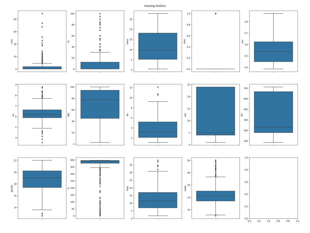
The next step is to identify outliers in the data set. Outliers are rows which have abnormal values; it's important to remove these when training a neural network as they will make it much harder to build an accurate model as they don't conform to the norm. To detect outliers, we'll look at the Interquartile Range of the data, that is, the values that fall outside the 25th to 75th percentiles. At this point we're simply going to plot the data for visualisation, however when we come to perform training we'll automatically remove the outliers.
# Outliers
plpy.notice('Outliers\n         --------\n')

Q1 = data.quantile(0.25)
Q3 = data.quantile(0.75)
IQR = Q3 - Q1
plpy.notice('Interquartile Range (IQR):\n{}\n'.format(IQR))
plpy.notice('Outliers detected using IQR:\n{}\n'.format((data < (Q1 - 1.5 * IQR)) |(data > (Q3 + 1.5 * IQR))))

plt.cla()
fig, axs = plt.subplots(ncols=plot_columns, nrows=plot_rows, figsize=(20, 5 * plot_rows))
index = 0
axs = axs.flatten()
for k,v in data.items():
   sns.boxplot(y=k, data=data, ax=axs[index])
   index += 1
plt.tight_layout(pad=5, w_pad=0.5, h_pad=5.0)
plt.suptitle('{} Outliers'.format(output_name.capitalize()))
plt.savefig('{}/{}_outliers.png'.format(output_path, output_name))
plpy.notice('Created: {}/{}_outliers.png\n'.format(output_path, output_name))
The first section of the code above will output a text based analysis of the outliers. First, it will display the interquartile range of values for each column in the dataset, and following that it will output a table corresponding to the rows and columns in the dataset, showing True for any values that are outliers. For example:
NOTICE:  Outliers
         --------

NOTICE:  Interquartile Range (IQR):
crim         3.595038
zn          12.500000
indus       12.910000
chas         0.000000
nox          0.175000
rm           0.738000
age         49.050000
dis          3.088250
rad         20.000000
tax        387.000000
ptratio      2.800000
b           20.847500
lstat       10.005000
medv         7.975000
dtype: float64

NOTICE:  Outliers detected using IQR:
      crim     zn  indus   chas    nox     rm    age    dis    rad    tax  ptratio      b  lstat   medv
0    False  False  False  False  False  False  False  False  False  False    False  False  False  False
1    False  False  False  False  False  False  False  False  False  False    False  False  False  False
2    False  False  False  False  False  False  False  False  False  False    False  False  False  False
3    False  False  False  False  False  False  False  False  False  False    False  False  False  False
...
18   False  False  False  False  False  False  False  False  False  False    False   True  False  False
19   False  False  False  False  False  False  False  False  False  False    False  False  False  False
...
The second section of the code uses Matplotlib with the Seaborn library to plot the outliers in box charts. This will be saved into the directory we specified in the function call, using the name given, e.g. /Users/Shared/tf/housing_outliers.png:
The blue boxes on the plots represent the group of values that fall within the interquartile range for each column in the dataset, whilst the dots represent the values that fall outside of the range, and thus make the row in which they are present candidates for exclusion from training.
Distributions
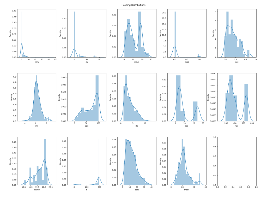
Now, we will look at the distributions of values for each column. This may not directly lead to us eliminating data from the training/validation set we'll use to build a model, although in some cases it might; for example, if a particular feature has an extremely narrow distribution it may be that we choose to exclude it entirely as it will likely have no bearing on the output. Regardless, this can be useful to help understand the characteristics of the data.
As with the outliers, the code first outputs text based analysis as NOTICEs (very easily generated by Pandas), and then generates charts to help with visualisation:
# Distributions
plpy.notice('Distributions\n         -------------\n')
plpy.notice('Summary:\n{}\n'.format(data.describe()))

plt.cla()
fig, axs = plt.subplots(ncols=plot_columns, nrows=plot_rows, figsize=(20, 5 * plot_rows))
index = 0
axs = axs.flatten()
for k,v in data.items():
   sns.distplot(v, ax=axs[index])
   index += 1
plt.tight_layout(pad=5, w_pad=0.5, h_pad=5.0)
plt.suptitle('{} Distributions'.format(output_name.capitalize()))
plt.savefig('{}/{}_distributions.png'.format(output_path, output_name))
plpy.notice('Created: {}/{}_distributions.png\n'.format(output_path, output_name))
The text output looks as follows:
NOTICE:  Distributions
         -------------

NOTICE:  Summary:
             crim          zn       indus        chas         nox          rm         age         dis         rad         tax     ptratio           b       lstat        medv
count  506.000000  506.000000  506.000000  506.000000  506.000000  506.000000  506.000000  506.000000  506.000000  506.000000  506.000000  506.000000  506.000000  506.000000
mean     3.613524   11.363636   11.136779    0.069170    0.554695    6.284634   68.574901    3.795043    9.549407  408.237154   18.455534  356.674032   12.653063   22.532806
std      8.601545   23.322453    6.860353    0.253994    0.115878    0.702617   28.148861    2.105710    8.707259  168.537116    2.164946   91.294864    7.141062    9.197104
min      0.006320    0.000000    0.460000    0.000000    0.385000    3.561000    2.900000    1.129600    1.000000  187.000000   12.600000    0.320000    1.730000    5.000000
25%      0.082045    0.000000    5.190000    0.000000    0.449000    5.885500   45.025000    2.100175    4.000000  279.000000   17.400000  375.377500    6.950000   17.025000
50%      0.256510    0.000000    9.690000    0.000000    0.538000    6.208500   77.500000    3.207450    5.000000  330.000000   19.050000  391.440000   11.360000   21.200000
75%      3.677083   12.500000   18.100000    0.000000    0.624000    6.623500   94.075000    5.188425   24.000000  666.000000   20.200000  396.225000   16.955000   25.000000
max     88.976200  100.000000   27.740000    1.000000    0.871000    8.780000  100.000000   12.126500   24.000000  711.000000   22.000000  396.900000   37.970000   50.000000
The graphical representation looks like this:
Correlations
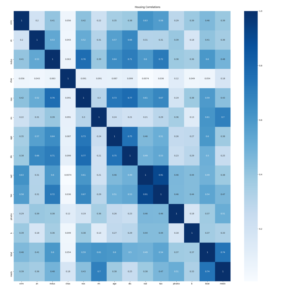
Whilst outlier detection is used to determine data rows that should be removed before training, data correlations can indicate columns or features to us that should be considered for removal from both training and data being analysed by the final model because they do not correlate to the output. In the analysis done to this point we've considered all columns or features in the dataset equally, however, we now need to consider which feature or features are our input, and which are output. In the case of this analysis, all the columns are the input, except the medv column which is the output, representing the value of a house in the original data set.
The code is pretty similar to the previous two examples; Pandas will generate the text based output for us directly from the dataframe, whilst Seaborn and Matplotlib will generate the graphical output:
# Correlations
plpy.notice('Correlations\n         ------------\n')

corr = data.corr()
plpy.notice('Correlation data:\n{}\n'.format(corr))

plt.cla()
plt.figure(figsize=(20,20))
sns.heatmap(data.corr().abs(), annot=True, cmap='Blues')
plt.tight_layout(pad=5, w_pad=0.5, h_pad=5.0)
plt.suptitle('{} Correlations'.format(output_name.capitalize()))
plt.savefig('{}/{}_correlations.png'.format(output_path, output_name))
plpy.notice('Created: {}/{}_correlations.png\n'.format(output_path, output_name))
NOTICE:  Correlations
         ------------

NOTICE:  Correlation data:
             crim        zn     indus      chas       nox        rm       age       dis       rad       tax   ptratio         b     lstat      medv
crim     1.000000 -0.200469  0.406583 -0.055892  0.420972 -0.219247  0.352734 -0.379670  0.625505  0.582764  0.289946 -0.385064  0.455621 -0.388305
zn      -0.200469  1.000000 -0.533828 -0.042697 -0.516604  0.311991 -0.569537  0.664408 -0.311948 -0.314563 -0.391679  0.175520 -0.412995  0.360445
indus    0.406583 -0.533828  1.000000  0.062938  0.763651 -0.391676  0.644779 -0.708027  0.595129  0.720760  0.383248 -0.356977  0.603800 -0.483725
chas    -0.055892 -0.042697  0.062938  1.000000  0.091203  0.091251  0.086518 -0.099176 -0.007368 -0.035587 -0.121515  0.048788 -0.053929  0.175260
nox      0.420972 -0.516604  0.763651  0.091203  1.000000 -0.302188  0.731470 -0.769230  0.611441  0.668023  0.188933 -0.380051  0.590879 -0.427321
rm      -0.219247  0.311991 -0.391676  0.091251 -0.302188  1.000000 -0.240265  0.205246 -0.209847 -0.292048 -0.355501  0.128069 -0.613808  0.695360
age      0.352734 -0.569537  0.644779  0.086518  0.731470 -0.240265  1.000000 -0.747881  0.456022  0.506456  0.261515 -0.273534  0.602339 -0.376955
dis     -0.379670  0.664408 -0.708027 -0.099176 -0.769230  0.205246 -0.747881  1.000000 -0.494588 -0.534432 -0.232471  0.291512 -0.496996  0.249929
rad      0.625505 -0.311948  0.595129 -0.007368  0.611441 -0.209847  0.456022 -0.494588  1.000000  0.910228  0.464741 -0.444413  0.488676 -0.381626
tax      0.582764 -0.314563  0.720760 -0.035587  0.668023 -0.292048  0.506456 -0.534432  0.910228  1.000000  0.460853 -0.441808  0.543993 -0.468536
ptratio  0.289946 -0.391679  0.383248 -0.121515  0.188933 -0.355501  0.261515 -0.232471  0.464741  0.460853  1.000000 -0.177383  0.374044 -0.507787
b       -0.385064  0.175520 -0.356977  0.048788 -0.380051  0.128069 -0.273534  0.291512 -0.444413 -0.441808 -0.177383  1.000000 -0.366087  0.333461
lstat    0.455621 -0.412995  0.603800 -0.053929  0.590879 -0.613808  0.602339 -0.496996  0.488676  0.543993  0.374044 -0.366087  1.000000 -0.737663
medv    -0.388305  0.360445 -0.483725  0.175260 -0.427321  0.695360 -0.376955  0.249929 -0.381626 -0.468536 -0.507787  0.333461 -0.737663  1.000000
The data is shown in a grid with a row and column for each feature. The intersecting cells contain the correlation value for those two columns. The cells intersecting the rows and columns of the same name have a correlation of exactly one as both axes represent the same set of values. We're primarily interested in correlations to the output value, medv. Unfortunately, that's tricky to see in the text output, but the coloured graphical output makes it much easier:
The darker the cell, the stronger the correlation between the two values is. Consideration should be given to removing the more weakly correlated features from the training/validation dataset, and of course, any later analysis that is performed using a trained model.
Closing Boilerplate
There is a small amount of closing boilerplate to complete the function:
$BODY$;

ALTER FUNCTION public.tf_analyse(text, text, text)
   OWNER TO postgres;

COMMENT ON FUNCTION public.tf_analyse(text, text, text)
   IS 'Function to perform statistical analysis on an arbitrary data set.

Parameters:
 * data_source_sql: An SQL query returning at least 2 rows and 2 columns of numeric data to analyse.
 * output_name: The name of the output to use in titles etc.
 * output_path: The path of a directory under which to save generated graphs. Must be writeable by the database server''s service account (usually postgres).';
The $BODY$ marker closes the Python code block, and the semicolon closes the CREATE FUNCTION statement. The remaining lines set the function owner to the superuser account and add a comment for documentation purposes, which is always good practice.
Conclusion
In part 1 of this blog mini-series, we looked at how to setup PostgreSQL so that we can perform regression analysis on our data using TensorFlow, from within the database server using the pl/python3 procedural language.
In this part, we've explored an SQL function that will perform various types of analysis on an arbitrary dataset to help us understand the data and make informed decisions about how we can train a neural network to perform regression analysis on similar data. We've made use of the Pandas, Matplotlib and Seaborn Python libraries to do so.
In the third and final part of the series, we will build a dataset based on the findings here, and use it to train a neural network that can be used for regression analysis, all from within PostgreSQL. Stay tuned!


